Optimizing the Checkout Experience for SHEIN
A case study focused on reducing friction in the checkout process
By Max Lopez
GIT 435 – Prof. Hopkins
April 28, 2025
Business Overview
Business Name
SHEIN
Industry
E-commerce
Products
Clothing, Home Goods, Appliances
Checkout Importance
The checkout process is essential to SHEIN's business. As a fully online marketplace, any friction during this stage directly impacts sales and customer satisfaction. A seamless, user-friendly checkout is vital for maximizing conversions, minimizing cart abandonment, and staying competitive in a fast-paced online retail space.
Target Persona

Name
Alina Soler
Age
22
Occupation
College student, part-time waitress
Monthly Budget
$1,200
Shopping Habits
Loves online shopping, often preparing for job interviews or life events.
Frustrations
- Uncertain shipping timelines
- Forced account creation
- Doubts about sizing and product quality
Alina is time-conscious and driven. She needs fast, low-stress checkout experiences especially when purchasing items for important events.
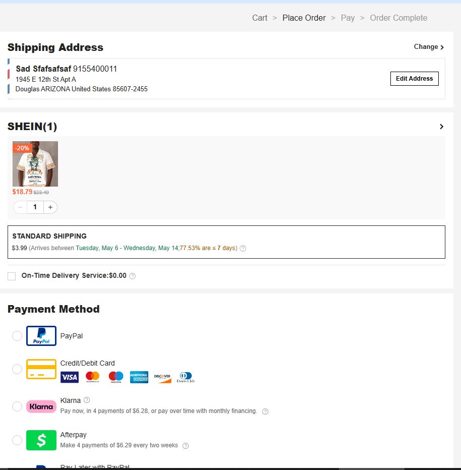
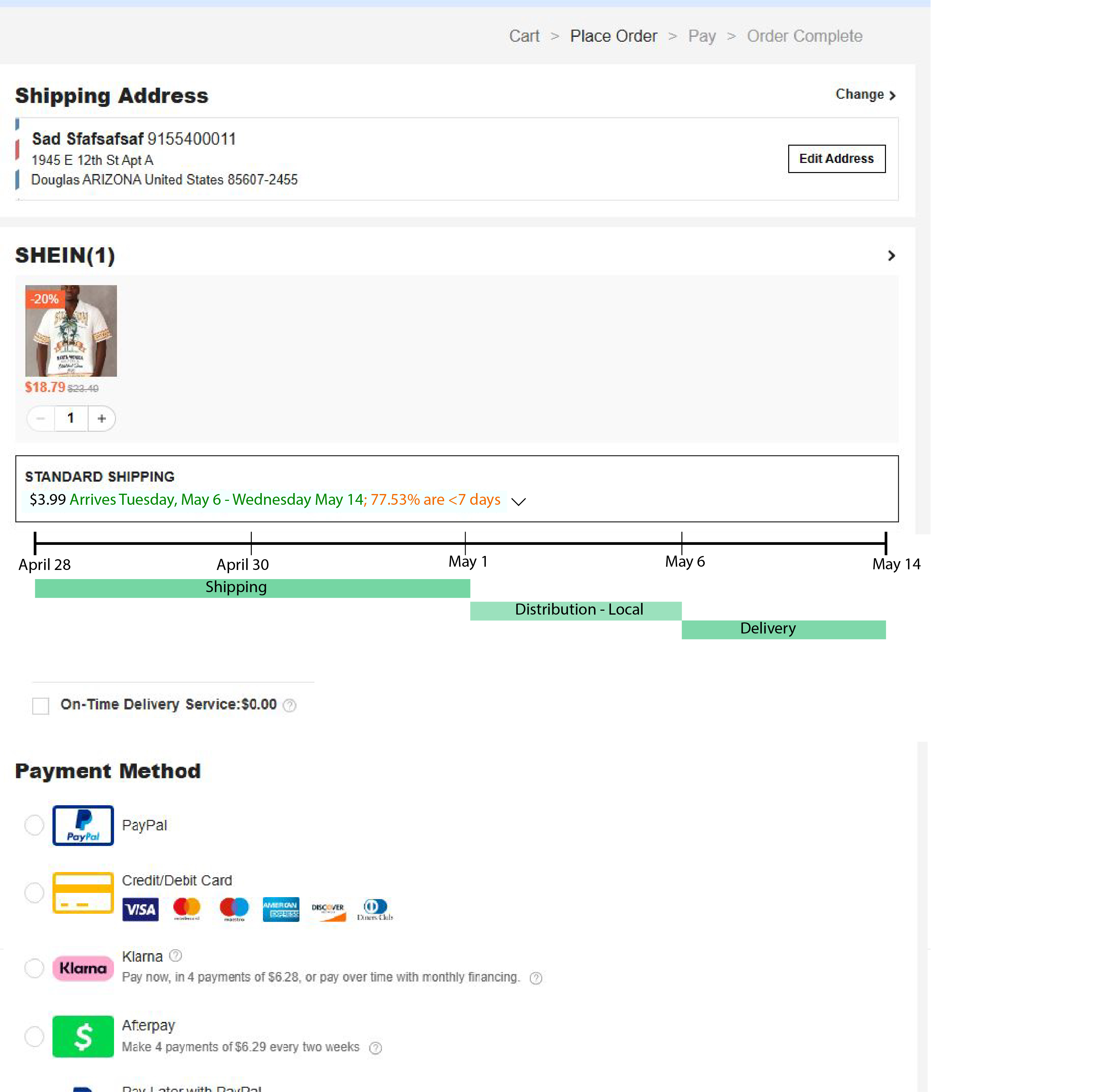
Current Checkout Flow Overview
Steps in SHEIN's Checkout:
- User browses and adds items to cart.
- Product reviews and user images help with decisions.
- Account creation is required at checkout.
- After purchase, confirmation is emailed.
- Delivery estimates are vague; tracking is limited.
Pain Points:
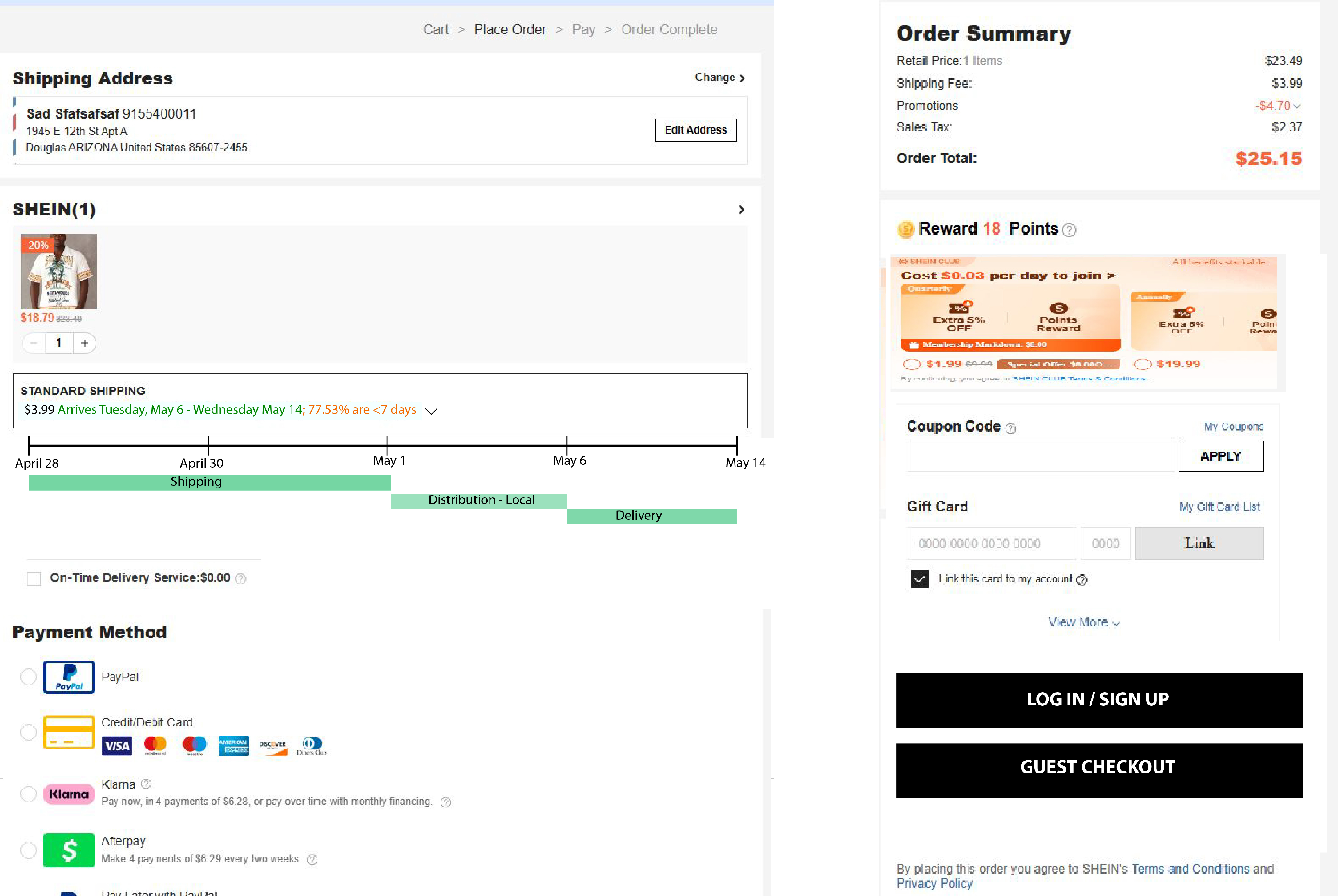
No Guest Checkout
First-time users must create an account.
Delivery Uncertainty
Vague shipping timelines and poor tracking.
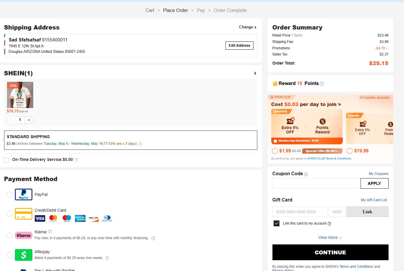
Visual Overload
Distracting promotions, inconsistent fonts, and lack of design cohesion reduce user trust.
Identified UX Issues
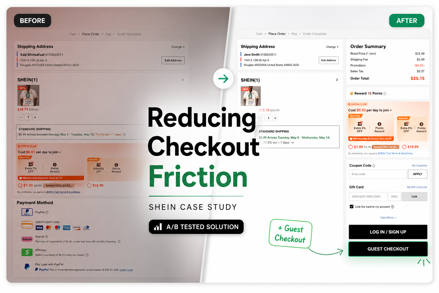
1. No Guest Checkout Option
First-time buyers like Alina are forced to create an account, which adds friction and discourages trial purchases.
2. Vague Delivery Timelines
Unclear estimates (e.g., "Arrives between May 5 - May 13") leave users anxious, especially when timing is critical.
3. Inconsistent Design
Mismatched fonts and cluttered visuals (like aggressive promotions) create a lack of trust in the brand's reliability.
Proposed UX Improvements
1. Guest Checkout Option
Problem
Account creation is a barrier for new users.
Solution
Add a prominent "Checkout as Guest" button.
Benefit
Reduces drop-off by allowing users to test the platform without commitment.
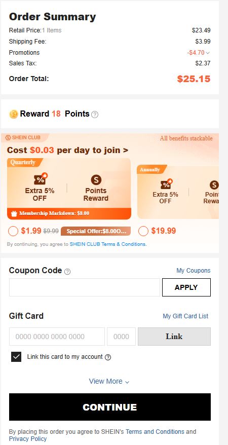
2. Improved Delivery Estimate Visibility
Problem
Unclear shipping info causes anxiety.
Solution
Add a "View Full Shipping Timeline" option.
Benefit
Builds trust and sets expectations, especially for time-sensitive orders.
3. Design Consistency and Simplified UI
Problem
Visual clutter reduces credibility.
Solution
Limit font usage and adjust promo placement.
Result
Improved credibility and reduced distraction.
User Impact
These changes create a more trustworthy and efficient checkout process, making it ideal for busy, budget-minded shoppers like Alina.
A/B Testing Plan
Test Setup
Version A (Control)
Current checkout flow
Version B (Variant)
Includes guest checkout, timeline visibility, and refined UI
User Split
Test Duration: 2 weeks (SHEIN's high traffic allows for fast data collection)
KPIs (Key Performance Indicators)
Revenue
Compare total sales generated by Control vs. Variant.
Checkout Conversion Rate
% of users who complete a purchase after adding to cart.
Cart Abandonment Rate
% of users who add items but leave without checking out.
Goal: Lower abandonment in the Variant group.
Why These KPIs?
Together, they measure trust, usability, and overall checkout success.
Persona Impact: Alina Soler
The proposed changes directly address Alina's needs:
-
Guest Checkout
Reduces friction for new users.
-
Shipping Confidence
Clear delivery info aligns with her planning habits.
-
Streamlined Design
Helps her focus and complete purchases quickly.
For a shopper like Alina, these updates create a stress-free, trial-friendly shopping experience likely increasing conversion and long-term loyalty.
Side-by-Side Visual Comparison
Current (A)
- No guest checkout
- Confusing delivery details
- Cluttered design
Improved (B)
- Guest checkout available
- "View Full Shipping Timeline" button
- Clean, consistent UI
Conclusion & Next Steps
Key Takeaway
Reducing friction through guest checkout, improving delivery visibility, and refining the UI can meaningfully increase conversions and trust for first-time buyers.
Future Ideas
- Personalized delivery estimate based on zip code
- User satisfaction score post-purchase
- Optional SMS updates for shipping